Summary: I made research and design persona profiles to evangelize user-centered design across the company.
Jump to: Context | Process | Result | Conclusion
Context
I worked for a global semiconductors company. They manage a wide range of electronic components for different industries, plus they sell entire solutions to be integrated into complex designs and they also offer consultancy services.
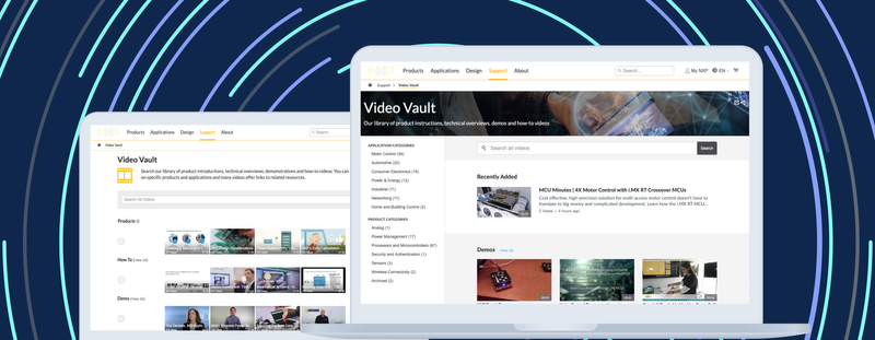
So the company's website offers an e-commerce, a training and support center, and some thought leadership content. In conclusion, it serves to different audiences and pages often mix those kinds of content.
The problem
The Marketing, Content and Design teams have several review meetings for new product pages and content redesign.
But they waste much time in rework after reviews, because every stakeholder has strong opinions on what's the users' context and their information needs.
Moreover, they don't have a place in common to discuss, validate and share users' information, but only project's analytics reports.
So we had to invest time on research, segment users's context and needs by audiences, and place that knowledge into the new Design System Website
The process
I made a research plan, without being aligned to sprints. It was a side-project for my spare time. But I found the time to include these activities:
- 8 Stakeholders interviews
- 8 User surveys during support calls
- 6 Interviews with engineers
- 3 Interviews with engineering managers
- 2 Workshop sessions (Stakeholders, Support team)
- 1 Analytics Trends Report (last year, last quarter, last month)
Stakeholders interviews
I started with the easiest people to contact. I interviewed different stakeholders–Sales, Support, Marketing, Engineering teams–to learn about:
- The primary content or action users need from their side
- The process they follow to create and deliver that content from their organization
- People inside the organization that could help me contact users
This was hard. People tried to reserve their sources. But I got the four audiences identified, and I met the support team and they were excited to having me listen all complaints they hear every day.
Surveys
Getting this information was harder. I asked some friends in the support team to ask for some extra details during troubleshooting calls. Questions were about peoples' context as the place, their interactions with other team members, pain points and desired solutions.
Those answers helped me to contact people from my network with a similar profile and interview them to get more details on their daily work so I could analyze the regular tasks, pain points and goals.
Users interviews
get info from research and place it. I had audios, questions, usability tasks over the website.
Empathy workshops
I had a workshop with the stakeholders so we could create some empathy maps and contrast them. Later compare the conclusions with the research I got. After that, I ran a similar session with the support team.
As a result of those workshops, I spread the news about my research and demystify some perceptions about users' preferences. I also found a way to get validation by an Analytics trends report.
Analytics report
The report had similar information and gave credibility on some insights. For example, after reading the personas some analytics were clearer, as:
I knew by research, that engineers were the decision makers of the pieces to buy–not managers, as it was supposed–so that explained why intermediate pages with tables to compare family specifications had more leads to buy than the inspirational, very produced pages with interactive graphs.
The result
Profiles
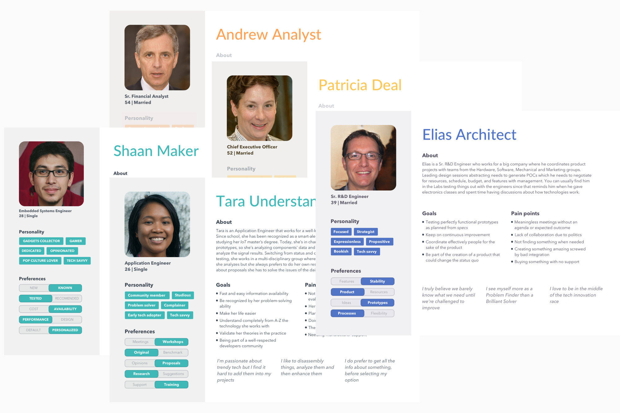
Drafts


Sharables


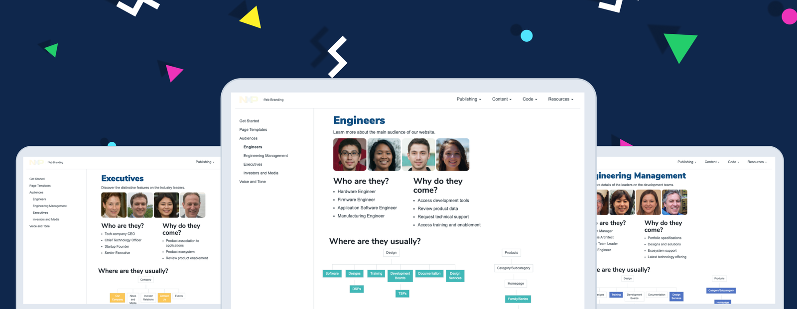
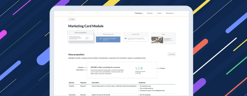
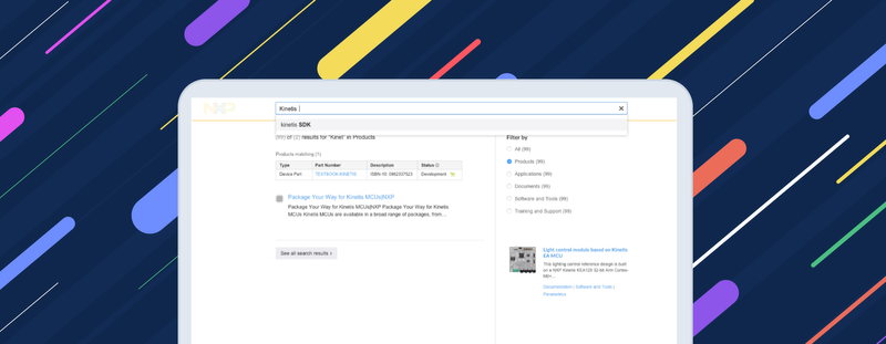
Integrating personas into our design system website


Page dedicated to every profile – Answers common questions about them, download profile info (hidden) and analytics insights (hidden)


Every profile has personas, insights and analytics
Evangelism – Training sessions

I hosted weekly sessions of two hours to offer a space for people in our organization to learn about:
- UX Design process
- Design critique and feedback
- Troubleshooting UI and content
- Sharing insights from the Support logs

Conclusion
These are some things that I learned from this side-project:
- Doing research with zero budget or time assigned. But earning the trust and leadership to align people from different departments towards a common task to benefit the company and our daily work.
- User interviews. Every every question had to be natural (not robotic) but specific so they could answer something that I could dig deeper later. It demanded special attention to hidden goals and emotions within the answers to discover pain points.
- Not being obsessed with perfect personas. They're only a tool to bring the discussion on the user instead of team's agenda or personal tastes
- Communicating this to my manager's manager was helpful to get his buy in and his support later to promote a responsible design during my training session.
